Mapping communication?

I have started to be interested in mapping projects long ago. The first really inspiring project i saw some 8 years ago was the ongoing "mapping of power structures" project dome by Bureau d' etudes and Memefest collaborator Brian Holmes. Here is one example of this fantastic work: http://bureaudetudes.org/files/2010/01/wordlgov2005.pdf
This was also something, that fascinated me: Skitter graph, which combines research snap shots of world wide internet usage, animating it in to a global techno political spectacle of unseen proportions.
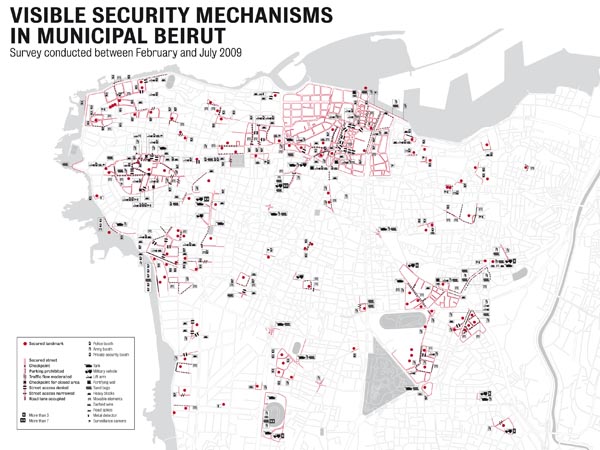
Due to a long lost friend of mine i got lately a bit more interested in global security and peace issues. Here again, a powerful mapping project: http://backspace.com/notes/2010/09/beirut-mapping-security.php#more
Where i want to arrive with this is actually the question of mapping radical/ socially responsive communication. How can we do that? What kind of visual language should we use? Which power relations could we and should we visualize if we focus on the process and effect of communication?
And what is the use of such visualization? I have a few answers to that in my pocket, but for now, i'll leave you with that.
In any case, this is one of the projects i'd really like to do in the future. If anyone's interested- let me know.

To comment, please create a Memefest account, it will take you only 2 minutes! Login here if you already have one.